BAYVIEW PROPERTY BRANDING/WEBSITE BUILD
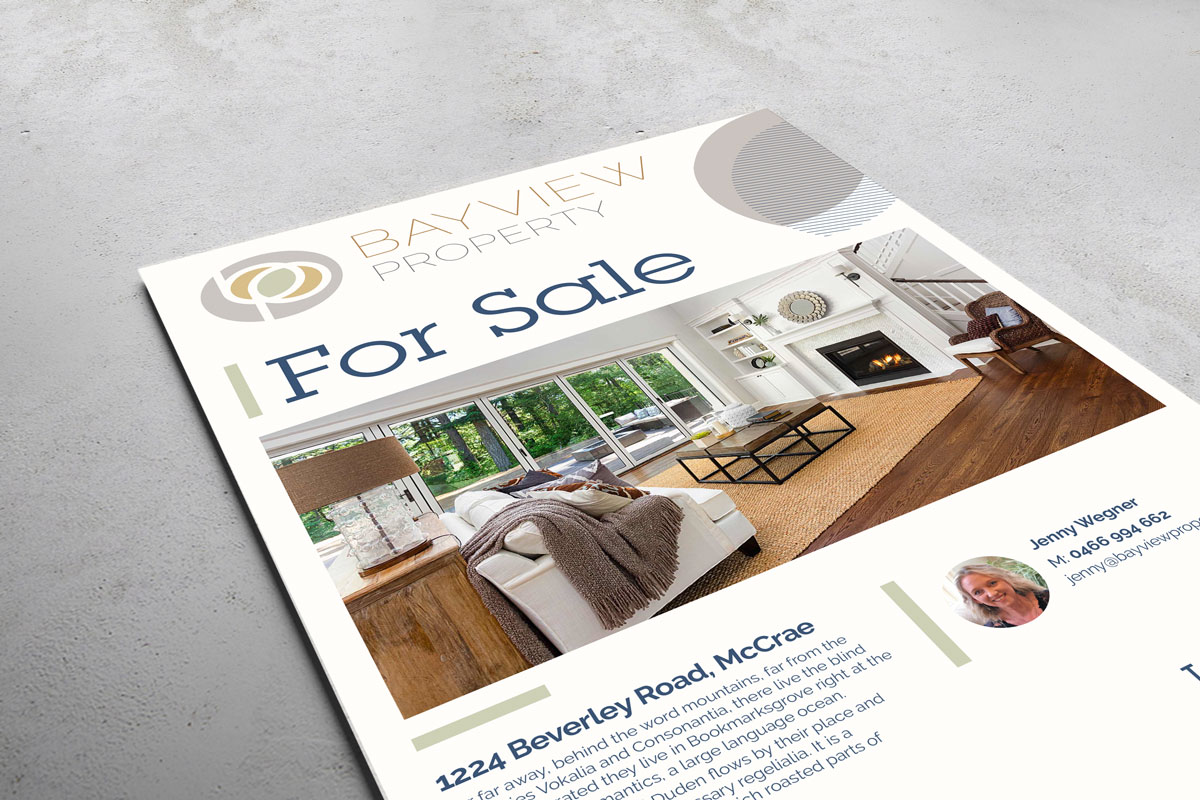
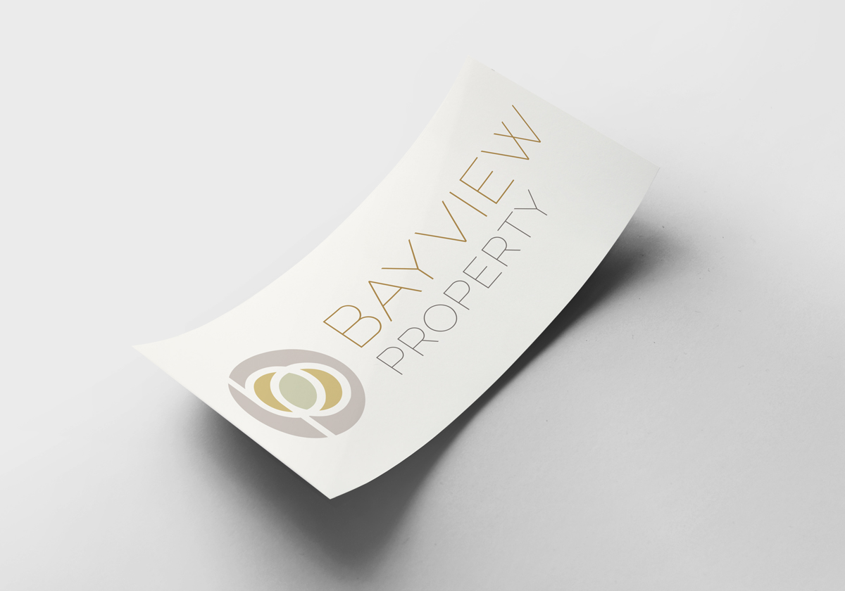
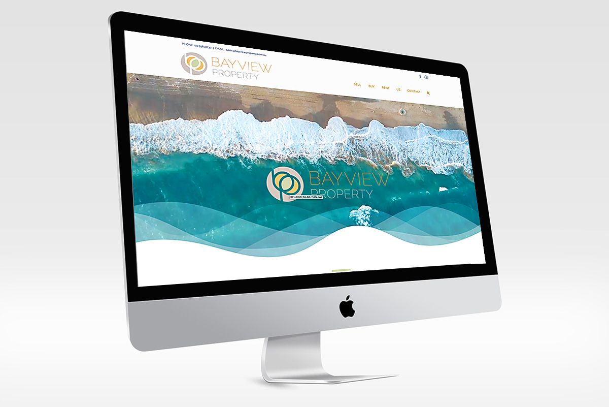
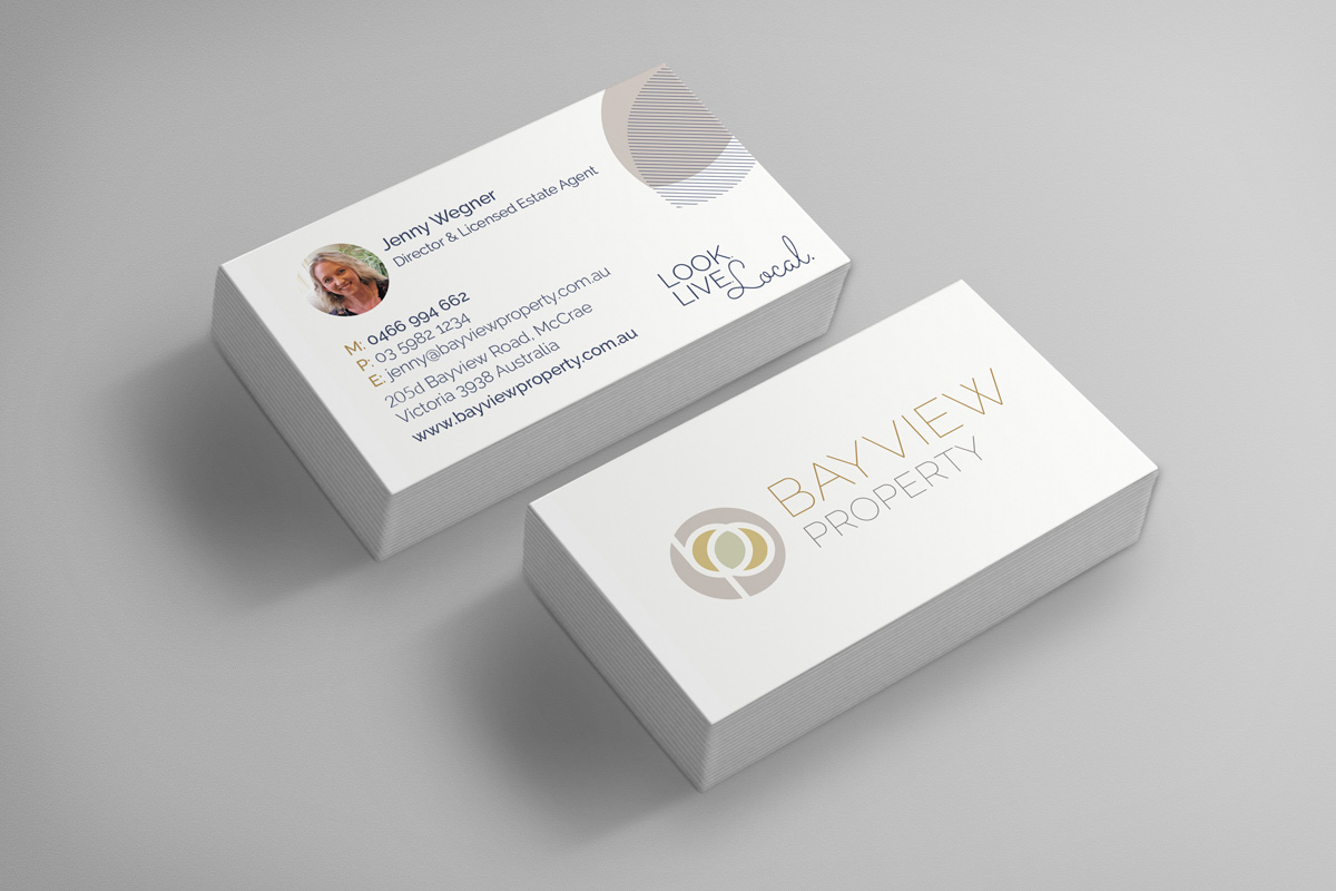
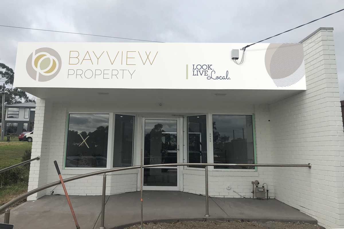
It was a real pleasure to meet and work with Jenny from Bayview Property. A long time estate agent on the Mornington Peninsula, Jen came to Worthy Creative to discuss her branding needs for her own Real Estate business. It was hard to get together because of the Covid restrictions but after a few online chats we came to an understanding of her business needs and the design style which she wanted us to create. The logo is based on the First letters of Bayview Property, and the ‘B’ and ‘P’ come together and in the middle form a leaf shape. Utilising this graphic shape formed by the logo and the colours within we formed a brand design for Bayview Property which carries through a continuity of graphic design across a broad range of collateral.
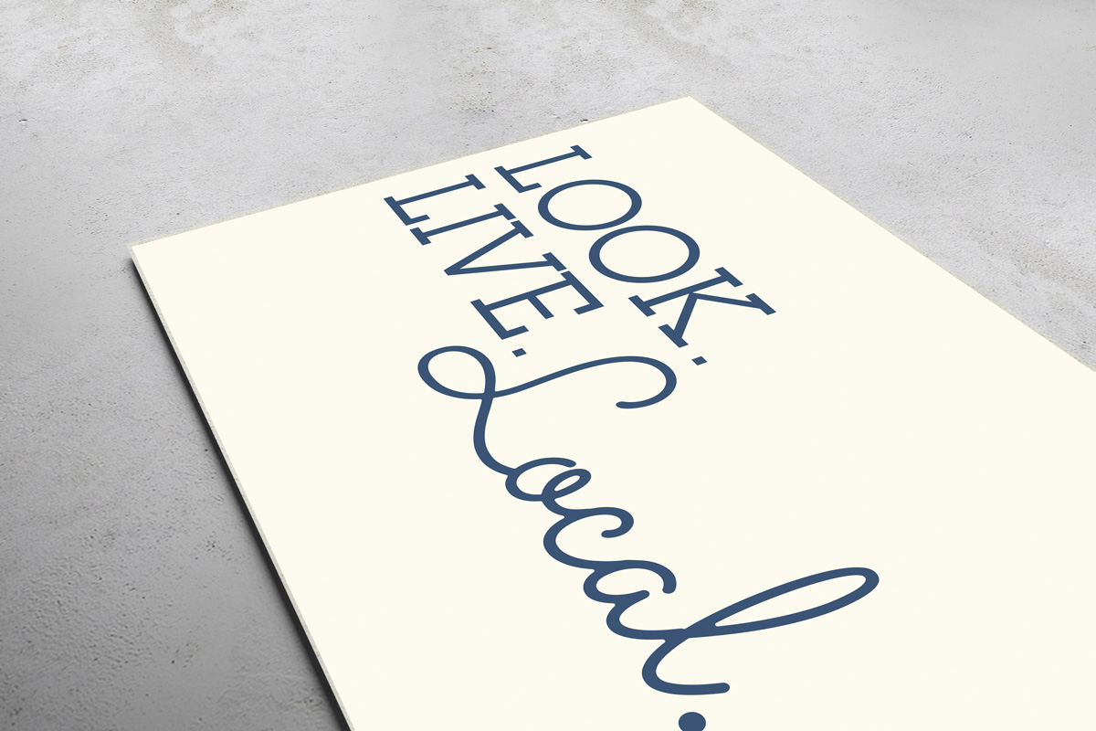
The centre shape of the logo on it’s own resembles a leaf, and in that I think represents growth. It also connects us with nature and earth and ultimately home; and ties in with Bayview Property’s ideals of helping people find their home. This leaf graphic element is a constant in all design and becomes a recognisable part of the brand identity.
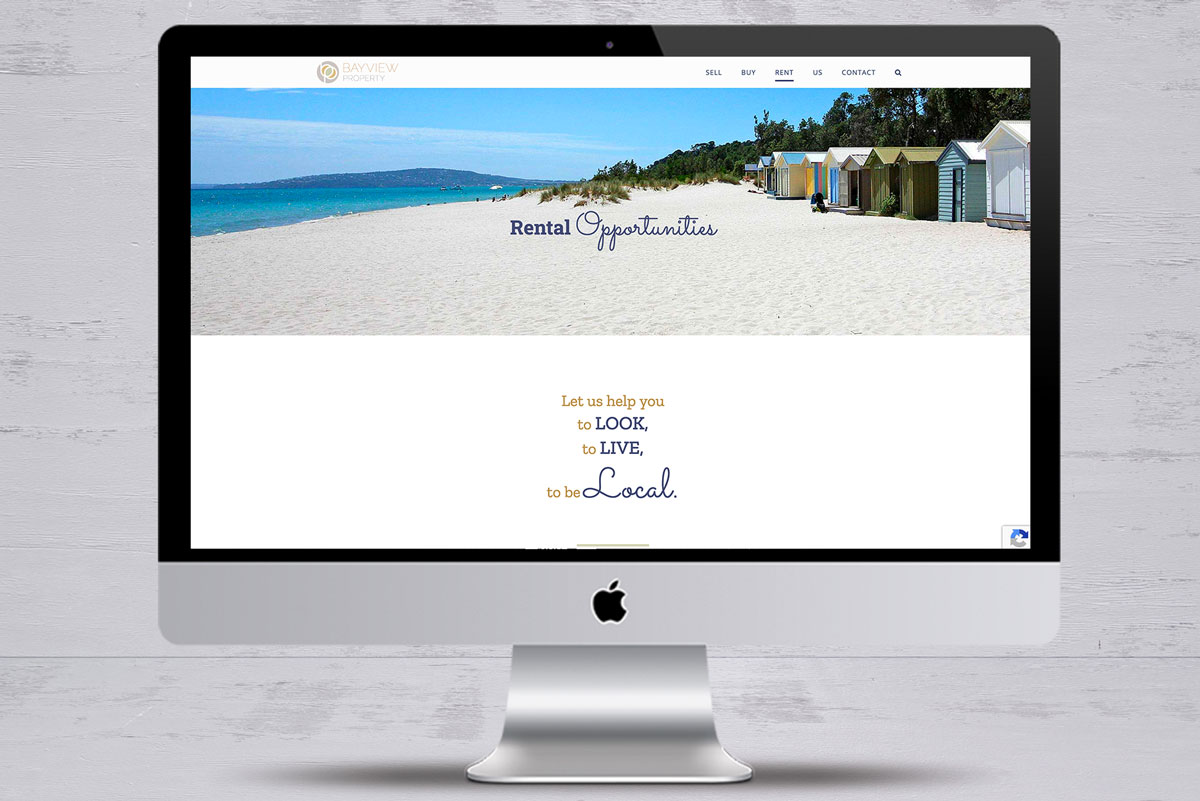
A creamy white, based on an Egyptian cotton paint base, has been used throughout as the background colour.
We’ve also used a solid line block element which highlights titles, divides text blocks and also adds to the design aesthetic by carrying the leaf colour from the logo into the designs.
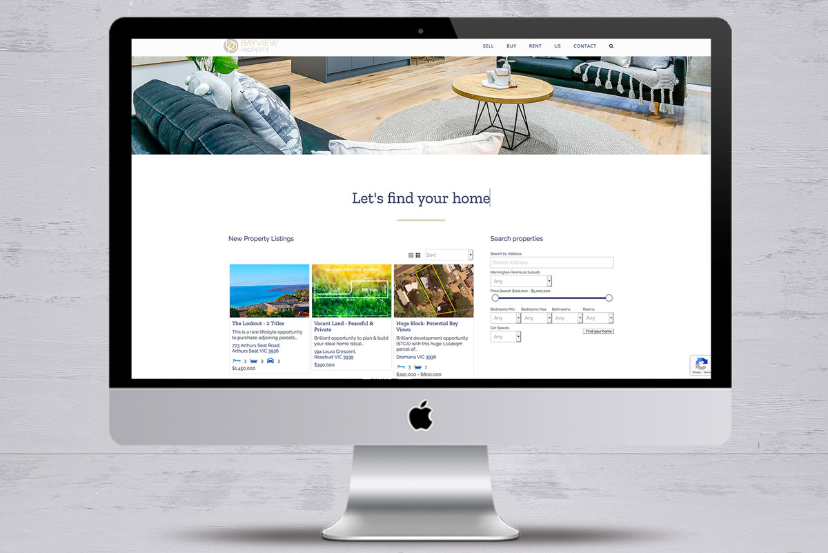
The website utilises real estate software to automatically bring in property from the CRM which Jen uses to list on various Real estate domains.
Click on the Project URL to view website.